

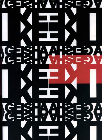
This is the cover magazine from 1998, so its dated but look at the design work. Even now, it looks current and appeals to the eye. Typographic students take notice..make your work classic..like this. The lines, the symmetry, bold element of color, all falls into to play for great design work.


No comments:
Post a Comment